In the age of online shopping and digital stores, captivating shoppers’ attention is a growing challenge for brick-and-mortar stores. One technique that has long proven its effectiveness is visual merchandising, a marketing practice that strategically pairs the display of products and services against floor layouts, color, lighting, and other elements to attract customers’ attention.
With over 55 stores, Chelsea Market, a bustling marketplace in New York City’s Meatpacking District, remains a strong player in the retail world by capitalizing on visual merchandising. Below, Thomas Ligor of New York explores the world of visual merchandising in Chelsea Market, the techniques stores use, and the success they find.
Framing the Architecture of Stores for Success
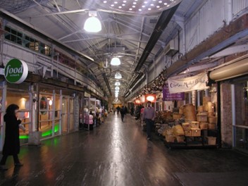
Once the National Biscuit Company (Nabisco) factory, Chelsea Market boasts a historic value to visitors and locals. The market is open to the public on the ground floor, allowing visitors and shoppers to roam through a long strip of stores selling food, clothing, furniture, and more.
The simple architecture of the warehouse provides a pivotal role in making the market inviting and exciting for visitors. Combined with the magic of visual merchandising, stores can add their touch to their space while accentuating the architecture of the historic building. A physical store’s architecture utilizes visual elements like floor layout to the positioning of items on windows and shelf displays to create a unique experience for visitors.
Using Lighting to Set the Shopping Atmosphere
Lighting can also play an important role in creating the right ambiance for shoppers. Warm lighting can make a store feel friendlier and smaller, while cool lighting can make a store feel spacious. Additionally, shoppers visiting a store with bright lights might feel more energized to shop quickly while shoppers visiting a store with dim lights may take their time in casually looking through items.
For example, Chelsea Market Baskets plays with warm, dim lighting and invites visitors to a cozy experience. With wicker baskets spilling out as their storefront, the store matches the grandness of their historic home. Visitors are immediately drawn to the treasure trove of the store and feel invited to browse through all the little and big items the store has to offer.

Showcasing Products and Services in Center Stage
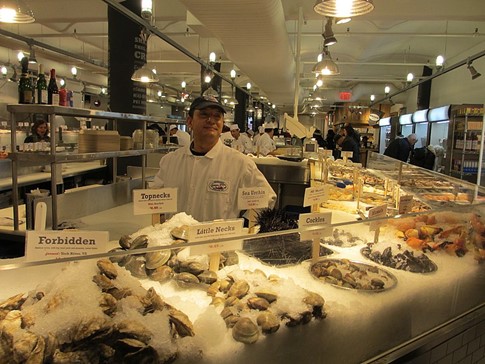
With over 9 million visitors per year, stores at Chelsea Market have just over a few seconds to spark interest in passersby, making visual merchandising instrumental. Fashion stores like Anthropologie utilize the traditional modeling of mannequins to display their latest wardrobe items for customers to see at first glance.
Others play with an open-door concept. For example, ALF Bakery brings a historical touch to its storefront by showing visitors the process of breadmaking. Visitors are immediately drawn to the hustle and bustle of the bakers, who market their fresh, warm-baked products front and center.
Conclusion
In-store shopping provides an experience still unmatched by digital shopping, and Chelsea Market is a marketplace that proves it.
From dressing up mannequins to displaying baked goods on the windows, the stores of Chelsea Market wield visual merchandising to continue keeping both locals and tourists entertained and intrigued.


